
Poster production, use PS to create gradient theme posters – poster design
This tutorial uses PS to create a purple color layout poster, which is mixed with gradients and filter colors. The whole combination is very beautiful and can be used in later design. Students can also add their own ideas to make it. Interested students Let’s learn something. www.16xx8.com Operation steps: First, create a new document. The size I used is 1200X900 pixels. Create a gradient adjustment layer and set the gradient color. The parameters are as follows: Use the Rectangle Tool to draw a rectangle with the color #29135e as the main body of our poster, then add a Drop Shadow layer style. (The operation method is the same as the previous several times). Next, I duplicated a layer of the rectangle, moved it down one layer, changed the fill to 0, readjusted the parameters of the drop shadow style, and paid attention to the layer blending mode of the drop shadow. (This step is to take care of friends with lower versions. If you use higher versions, just add two projection styles directly) Next, I created a layer group, ready to make the inner part of the rectangular body. For convenience, the shape we make will not exceed the…
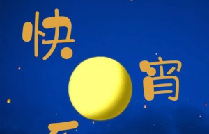
Poster production, use PS to create a festival poster for the Lantern Festival on the 15th day of the first lunar month – poster design
The Lantern Festival in 2019 is over after the New Year. No, the New Year has passed us again. Do you students have a little bit of fun? The New Year is over, and learning can’t stop. This tutorial uses PS to make a The Lantern Festival-themed posters have cute fonts, and there are dynamic and static ones. Students can make them according to their own needs. Dynamic creation is also very simple. Sometimes students think that dynamic ones are difficult to make. In fact, they have not practiced correctly. Let’s learn more specifically through tutorials. If you want to learn more, please visit www.16xx8.com Tutorial material: http://www.16xx8.com/photoshop/sucai/2019/w634561.html Operation steps: Create a new 1080×1440 pixel document, select an image, and adjust the brightness. Create a new group, type “Lantern, Xiao, Festival, Kuai, Le” respectively, with the color #e0a540, then open the word source, search for Hanyi Ziyan cartoon, and activate the switch. Duplicate a group, change all layers, fonts to Hanyi Glutinous Rice Balls, and color to #d5795c. Don’t feel weird at first, you will know it later. In the middle of the two groups, hold down shift and draw a circle. I directly found a moon material, which is…
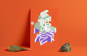
Poster production, use AI to create a sketch cartoon style poster – poster design
@野鹿志: In this tutorial, we use AI to create a sketch cartoon style poster. The entire tutorial is relatively simple and of medium difficulty. Students with basic knowledge can complete it quickly, but some details will require a little patience and time. Students can follow the tutorial and use it in later design or wherever posters are needed. Let’s learn how to operate it together. Rendering: www.16xx8.com Operation steps: Open Ai and create a new drawing board of any size: Make a few color blocks first so that you can absorb colors later: Draw a rectangle the same as the artboard, and use Ctrl+2 to lock it as the background color: First make a reference line and draw a 200*200 square with any color: Execution effect – 3D – Extrusion and bevel, the position is selected as equiangular – left or right, the extrusion thickness is also 200, and the surface is selected as wireframe: In order to see it more clearly, you can expand the wireframe cube and make the stroke thicker: There is no need to say much about the move and copy step. The final Ctrl+2 lock is probably like this: Select the appropriate font and font…
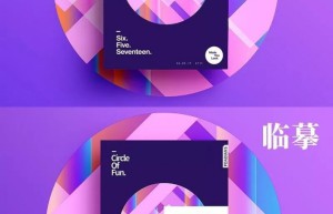
Poster production, use PS to create gradient theme posters – poster design
This tutorial uses PS to create a purple color layout poster, which is mixed with gradients and filter colors. The whole combination is very beautiful and can be used in later design. Students can also add their own ideas to make it. Interested students Let’s learn something. www.16xx8.com Operation steps: First, create a new document. The size I used is 1200X900 pixels. Create a gradient adjustment layer and set the gradient color. The parameters are as follows: Use the Rectangle Tool to draw a rectangle with the color #29135e as the main body of our poster, then add a Drop Shadow layer style. (The operation method is the same as the previous several times). Next, I duplicated a layer of the rectangle, moved it down one layer, changed the fill to 0, readjusted the parameters of the drop shadow style, and paid attention to the layer blending mode of the drop shadow. (This step is to take care of friends with lower versions. If you use higher versions, just add two projection styles directly) Next, I created a layer group, ready to make the inner part of the rectangular body. For convenience, the shape we make will not exceed the…
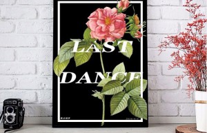
Poster production, use PS to design a beautiful creative poster that combines graphics and text – Poster Design
This tutorial uses PS to design a beautiful creative poster that combines graphics and text. The entire tutorial is relatively simple and mainly uses the Mask function. Masking can be said to be the essence of color mixing and drawing. Pay attention to a few things. The details can be completed very well. The specific tutorial still needs to be made through PS. I believe students can complete it better according to the tutorial. Some inspirations for poster design come from creativity. In detail, you still need to read more and practice more to make it beautiful. poster. Rendering: Operation steps: First, create a canvas the size of the picture: www.16xx8.com Import a picture of flowers downloaded from the Internet and fill the canvas: Select the Rectangle Tool. Cancel the fill, white stroke, 20 pixels (the specific parameters are determined according to your own situation, I also follow my feeling) Draw a white rectangular border of a certain size in the picture: Click on the text tool. Adjust text size, spacing, line spacing and other parameters to achieve aesthetics. Enter “LAST DANCE” (you can enter any text you want), Right-click the border layer and select “Rasterize Layer”.…
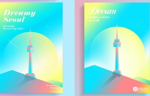
Poster production, make colorful posters with gradients – poster design
This poster is imitated from the work of a Korean designer Song hojong. It looks a bit like the “Monument Valley” game. The overall color is light and light. This tutorial teaches how to use this gradient and colorful poster work of PS Imitation Master. Drawing is difficult. It depends on creativity. Let’s practice together. First, here are the renderings made by the master (left) and the effect we made (right). www.16xx8.com Create a new document. I used 1200X1500 pixels. Feel free to create a gradient fill and a gradient background. Use the Rectangle Tool to draw a rectangle and add a Gradient Overlay. Use the pen tool to draw the shape in the lower left corner, load the selection of the rectangle just now, create a mask, and add a gradient overlay. Similarly, use the pencil tool to draw the shape on the right underneath the shape on the left. Similarly, load the rectangular selection, create a mask, and add a gradient overlay. Next, select the Ellipse Tool, draw the middle circle, add the same mask, and then add a Gradient Overlay. Here’s a little trick. When the layer style gradient overlay dialog box pops up, when you move…
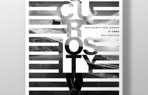
Poster production, use PS to create a character poster with blinds effect – Poster Design
@野鹿志: This tutorial uses PS to create a character poster with blinds effect. The original character has both characters and background images. We mainly use the selection and layer mask , add some typesetting arrangements later to achieve the effect of the poster. The whole tutorial is not difficult, but the adjustment of the details requires students to devote patience and energy. What are you waiting for? Let’s make this blind-style character poster together. Rendering: www.16xx8.com Operation steps: Open PS and create a new canvas of any size: Drag in the background material prepared in advance and adjust it to the appropriate size: Create a new black and white adjustment layer and convert it to black and white. Then CTRL+SHIFT+ALT+E to stamp a new layer as a new background: Then drag the character material in and cut out the picture. There is no need to say more about this step: There is no need to cut it out very carefully, it will be dealt with later anyway. After cutting out, it will probably look like this: Just like the background layer, create a new black and white adjustment layer and convert it to black and white, then stamp the…
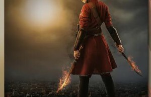
Poster production, using PS to create foreign magical poster post-production – photo synthesis
This tutorial uses PS to create a foreign magical poster. There are many steps in the entire tutorial, which are combined with a variety of materials to synthesize the effect. The entire tutorial has the feel of a movie poster, and the difficulty of making it is medium. There are steps, such as giving architectural drawings. When adding mask to a layer, you need to draw details. Students should be more careful when doing this. Let’s follow along together. Rendering: Materials used in the tutorial: Based on past experience, this tutorial fully takes care of many friends who are new to PS, so those who have a certain basic knowledge can skip some steps by themselves. Back to business 1. Create a new document. Please refer to the diagram for parameters 2. Place the architectural materials into the scene, use ctrl+T to reduce the height appropriately (not scale proportionally), the purpose is to increase the sense of perspective under the perspective 3. Insert the cloud material and adjust it to the position and size as shown in the picture (of course you can also adjust it according to your own feeling, as long as it looks comfortable) 4. Now let’s…

Poster production, using PS and AI to create an origami effect letter poster – poster design
@野鹿志: This tutorial combines PS and AI to create an origami effect letter poster. The text perspective and splicing of this effect can actually be done in PS. Students who like to use PS can complete it in PS. The same, according to Just make your own choice based on your own habits. The whole poster is very creative. Students can learn from the poster to make designs in other styles. With the guidance of the video, I believe students can do great. Let’s learn the specific tutorials through the tutorial. Tutorial material: http://www.16xx8.com/photoshop/sucai/2018/s968719.html Rendering: www.16xx8.com Video: Operation steps: Open Ai to create a new drawing board of any size: Type text: Ctrl+Shift+O outlines the text and ungroups it, then select the Free Transform tool: Transform each part separately to create perspective: Just do it based on your feeling. Just make it look like a staircase. It will look like this after you finish it. Then you will find that some overlap more and some have larger spacing at the red arrows: Adjust the details so that the letters just overlap: Be patient. When adjusting anchor points, it will be much easier to make good use of the alignment tools.…
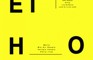
Poster production, use PS to create a unique lens effect poster – effect tutorial
This tutorial uses PS to create a lens effect poster. What exactly is a lens? It’s a trivial matter, as long as the students practice through the tutorial, it will be known. It is really worrying to ask the students to learn. Although it is a poster tutorial, we mainly learn this production method. The tutorial will use Go to the timeline to complete the tutorial. The entire tutorial is relatively simple. Let’s learn it together. Material: http://www.16xx8.com/photoshop/sucai/2018/n209280.html Rendering: www.16xx8.com Operation steps: First, open ps and create a new yellow canvas: First make a rough poster and lay out the layout. Because making posters is not the main content of today’s tutorial, I will just briefly mention: Group all layers and name them “Bottom”: Duplicate the “bottom” layer of the group to get the “bottom copy” layer, change the color of all the contents of the “bottom copy” layer to white, and adjust the content size appropriately. Don’t ask me why I do this, you will know later, as shown in the picture: Between the two group layers, draw a circle: Convert the “bottom copy” layer and the circle layer to Smart Objects: Select…


