“Peace Elite” is a passionate game loved by young people. I believe there are many “Peace Elite” among the students. Have you ever thought about how to make a poster for “Peace Elite”? “I’ve thought about it, but I can’t!” Today I will teach you how to make your game poster look like a blockbuster and become a qualified Peace Elite. If you finish it, you’ll have good luck eating chicken tonight; if you don’t finish it, you won’t be able to eat the chicken in a box. Let’s learn more through the tutorial.
Rendering:
 If you want to learn more, please visit www.16xx8.com
Regarding war game-themed posters, let’s first browse the Internet to see what these posters look like.

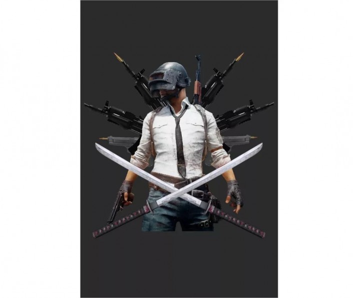
After browsing randomly on the Internet, we found this picture as the main body of our picture and started compositing it.

Based on similar posters, we choose the following elements as our synthetic materials. Although there are problems with tone and light and shade, we can solve them through processing. Let’s start designing.
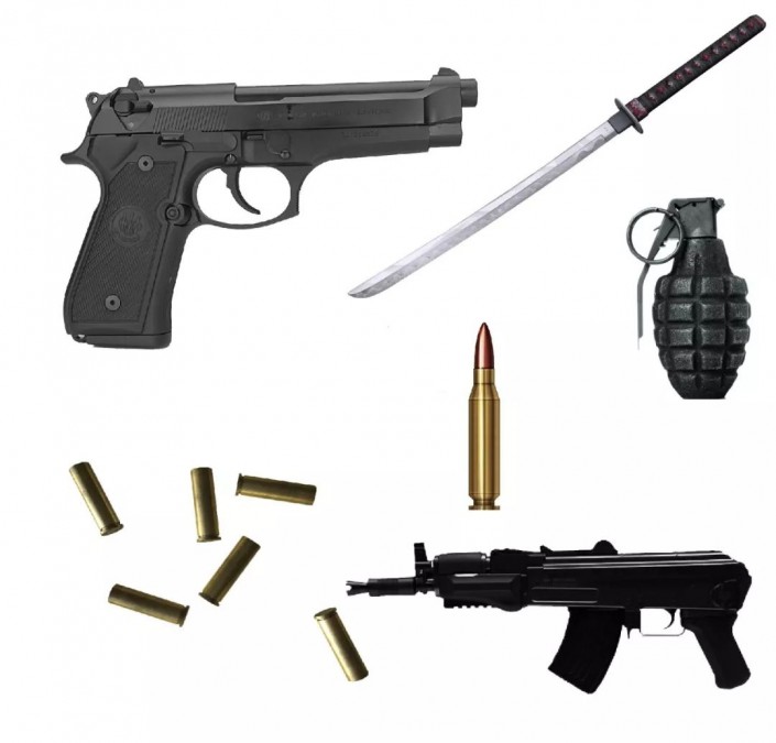
We first put the appropriate elements into the picture for simple display. We found that there are big problems in terms of brightness, color or light and shadow. Let’s deal with it step by step.
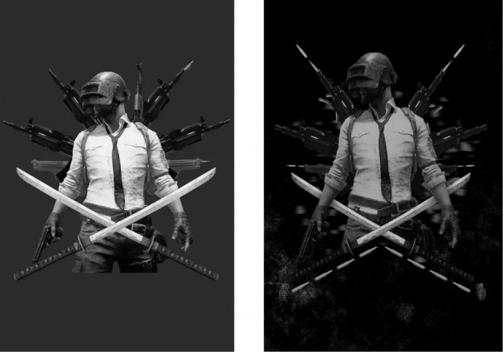
We add a hue and saturation on the top of the layer and make it into a grayscale image first. This is to facilitate us to use color levels to adjust the light and dark relationship of each element.

Here we add motion blur to the bullet so that the element can better integrate into the picture and have a certain momentum, expand the sense of space, and combine it with our bullet case element.

We are now making overall adjustments and coordinating the elements so that they can be combined in an orderly manner.

Let’s add a fragment behind the character, or use motion blur. Just be casual when drawing the fragment. Anyway, it can’t be seen clearly after blurring. From the perspective of brightness, we have solved it. Let’s take a look at the before and after comparison effect. Next we Start working with color.
We adjust the color of the background and adjust the opacity accordingly. Here I choose 30%.

We add texture to make the elements better combined, and use the linear dodge (add) layer blending mode to blend them in well. Next, we will finish the layout.

After adding the typesetting, we found that the picture feels very good. We should pay attention to embellish the picture appropriately when using colors. We used the element splicing method in this synthesis, which is especially suitable for novices to practice. You can try it.

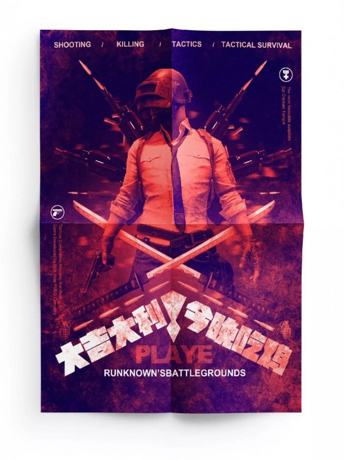
Finally, we made a prototype effect to improve the texture of the poster.
 If you want to learn more, please visit www.16xx8.com
If we want to make the picture more explosive, we can use the gradient mapping in PS to make overall adjustments.

“Peace Elite” is a passionate game loved by young people. I believe there are many “Peace Elite” among the students. Have you ever thought about how to make a poster for “Peace Elite”? “I’ve thought about it, but I can’t!” Today I will teach you how to make your game poster look like a blockbuster and become a qualified Peace Elite. If you finish it, you’ll have good luck eating chicken tonight; if you don’t finish it, you won’t be able to eat the chicken in a box. Let’s learn more through the tutorial.
Rendering:
 If you want to learn more, please visit www.16xx8.com
Regarding war game-themed posters, let’s first browse the Internet to see what these posters look like.

After browsing randomly on the Internet, we found this picture as the main body of our picture and started compositing it.

Based on similar posters, we choose the following elements as our synthetic materials. Although there are problems with tone and light and shade, we can solve them through processing. Let’s start designing.

We first put the appropriate elements into the picture for simple display. We found that there are big problems in terms of brightness, color or light and shadow. Let’s deal with it step by step.

We add a hue and saturation on the top of the layer and make it into a grayscale image first. This is to facilitate us to use color levels to adjust the light and dark relationship of each element.

Here we add motion blur to the bullet so that the element can better integrate into the picture and have a certain momentum, expand the sense of space, and combine it with our bullet case element.

We are now making overall adjustments and coordinating the elements so that they can be combined in an orderly manner.

Let’s add a fragment behind the character, or use motion blur. Just be casual when drawing the fragment. Anyway, it can’t be seen clearly after blurring. From the perspective of brightness, we have solved it. Let’s take a look at the before and after comparison effect. Next we Start working with color.

We adjust the color of the background and adjust the opacity accordingly. Here I choose 30%.

We add texture to make the elements better combined, and use the linear dodge (add) layer blending mode to blend them in well. Next, we will finish the layout.

After adding the typesetting, we found that the picture feels very good. We should pay attention to embellish the picture appropriately when using colors. We used the element splicing method in this synthesis, which is especially suitable for novices to practice. You can try it.

Finally, we made a prototype effect to improve the texture of the poster.
 If you want to learn more, please visit www.16xx8.com
If we want to make the picture more explosive, we can use the gradient mapping in PS to make overall adjustments.


 微信扫一扫打赏
 支付宝扫一扫打赏

